5B4 Photography and Books is now at www.patreon.com/jeffrey_ladd
As of now 5B4 Photography and Books is continuing at www.patreon.com/jeffrey_ladd
![]()

As of now 5B4 Photography and Books is continuing at www.patreon.com/jeffrey_ladd
![]()

After the Kassel festival I suffered from a bit of photobook burnout. The festival is growing to a decent size but 4 twelve hour days looking and talking about books can send even the most dedicated to seek a break. So, I wanted to intersperse a few non-photo related books over the next weeks which I found irresistible on this trip.
The first is a book which was published by Matthew Marks Gallery and Steidl in 2007 and can be found at a very cheap price on some remainder tables in Europe - Ellsworth Kelly: Drawings on a Bus, 1954. My copy set me back a measly 12 euros.
After six years in Paris, Kelly returned to New York in 1954 where a friend gave him a hardcover publisher's dummy of an old Sigfried Giedion Bauhaus book from the 20s thinking the blank pages would be perfect for sketching.
While riding the bus, this sketchbook (number #23), was filled with the chance drawings of the bus window shadows as they fell across the pages. Quickly marking the pages with the various changing shadows, he later inked in the outlines at his studio. Some of these sketches he later developed into larger paintings.
Abstract and in bold black and white they define the space on the page with graphic impulsive gestures which seem closer to typography than a response to simple light and dark patterns on the paper. The sequence reveals the pages filling with more black giving the sense of zooming in on the subtle nuances of these shadow/letter forms until an oval void spread across facing pages punctuates the ending.
The size of the book, the cardboard slipcase, printing and length feel near perfect. The fact that the blue cover - originally designed by the great Laszlo Moholy-Nagy for Giedion's book Bauen in Eisenbeton, Bauen in Eisen, Bauen in Frankreich - remains intact with Moholy-Nagy's typography and design suits the content in resonant ways.
![]()

One of the foundations of Joachim Schmid's work is the thought that there are way too many photographs in the world already so why not put those that exist to some intelligent use. At least, let us look at them a second time and contemplate their existence, or recontextualize them and introduce further questions of what we look at, what we draw in meaning, and what are the lasting values of the images. His latest book L.A. Women has a darker, real life context which is why I have chosen it as a follow up to Watabe Yukichi's A Criminal Investigation.
In December 2010, the Los Angeles Police Department released 180 photographs of women found in the home of a known serial murder suspect. The release of the images was a public appeal for help in identifying the women who might be missing and those still alive as the known victims number only a dozen. The photographs do not tell which are which, they provide only a pool of possibility.
Without the context of sensational serial murder attached, the images appear to be innocuous portraits made with poor quality film, digital and video cameras. All are black women but for two whites. Some would look like pictures that people post to Facebook pages or snapped by friends. Many of the women smile, some appear asleep, many sit in the passenger seats of cars. A few of the images reveal small clues that some of the women might be exposing their breasts to the photographer although none of the croppings reveal any nudity.
With the context of being attached to the suspect, we search for grim clues. Many of which appear to have been taken in the back of a van. We notice that the rear windows have been masked with opaque paper or tinfoil. Some might be prostitutes but as Schmid says in his introduction, "We don't know," not even if the suspect took the images himself. One is snapped standing outside of the vehicle through the open passenger side window. She smiles as if stopping to chat with a neighbor. Does she know the driver or is the smile an automatic instinctual response to the camera? Is she being enticed into the car? offered a ride? In another, the photographer casts a shadow as he(?) frames a vertical but nothing is revealed that might lead the investigation. We feel the pull of information but are left dangling within the eeriness of the images.
We stare into the faces, some blurred by technical imperfections, and are confused by their calm expressions and smiles. We know the potential of the situation they are frozen within and for a moment we connect on a basic human level for survival - to warn and protect. Or, perhaps like viewing an image of a person before execution, we look to feel fear and master death one image at a time.
L.A. Women is available through Blurb. Joachim Schmid is a part of the ABC (Artists' Book Cooperative) which is currently the subject of a show at New York's Printed Matter.
![]()

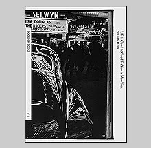
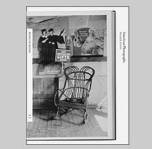
Many of you have wondered if 5B4 is dead. The answer is no, I needed a two month break. Not because I am too busy publishing (I always keep myself very busy) but because I was having trouble finding things to write about. I am not a professional writer nor critic so finding something to say which I haven't already in the past 400+ posts can be a bit of a task. That said, I just attended the Kassel Photobook festival with a small satchel of items which has me excited to spread the word on a few books I discovered. Watabe Yukichi's A Criminal Investigation from the publisher Xavier Barral is my first choice of favorites so far.
Sitting closely to the tradition of a photo novel, A Criminal Investigation follows a police detective in 1958 Tokyo as he investigates a gruesome crime - the discovery dismembered body near Sembaku Lake in Ibaraki Prefecture. Accompanying the detective was the photographer Watabe Yukichi who seems to have documented the progress of the case as thoroughly as the investigators did to the crime.
Yukichi was a freelance photojournalist who was granted special permission to document the "dismembered-corpse case" as it was referred. Shooting in black and white 35mm, the results play out like a film noir, complete with the detective looking more and more like a Japanese Humphrey Bogart as the story develops. In fact, as one becomes drawn into the filmic quality of every detail of the pictures and sequence, it is easy to overlook that this was an actual criminal investigation was of something so sinister.
As a photographer, Yukichi worked this situation with apparent vigor. Each and every picture is interesting in its own right - I can't find a superfluous image in the edit. Bookwise, A Criminal Investigation has a near perfect form and tone for such an essay with Japanese folded pages and a deep gravure-like printing. Its unique page twisting design causes interesting breaks in the flow of images like small chapters or vignettes as the case turns its various corners. A minimal amount of text contributes the facts of the case and the conclusion which took several more years to solve. I won't spoil the ending.
A Criminal Investigation was co-published by Le Bal in Paris which currently has an exhibition of this work along with Yutaka Takanashi and Keizo Kitajima. Copies are available in the Le Bal bookshop.
![]()

Writing in the foreword to his 1996 book Am Boden (By the Ground) Boris Mikhailov states; The fourth year of change. Not much has been reorganized, but a lot has changed. I already notice the tendency towards a "new" society, a deterioration in the quality of life for most people and the waning hope that some time everything will turn out fine for them. He continues; To a certain extent, I was always a street photographer. I always searched the streets for historical symbols of the present times. The streets reflect social processes like a mirror. What that book and its companion Die Dämmerung (At Dusk) described was bleak - everything seems to have collapsed at once spreading, in Mikhailov's words, the feeling of a natural catastrophe. It was felt in the book's titles - the darkening end of an era and the lowered perspective pulling us to the earth. the title of his newest offering Tea, Coffee, Cappuccino published by Verlag der Buchhandlung Walther König might be signaling a lighter, more positive view. Guess again.
Photographing in his hometown of Kharkov, Mikhailov has once again taken to the streets to reflect social process. On the cover, three men laugh and smile good-naturedly at the camera, almost mocking the choices offered by the book's title. What choice has been given by the arrival of western splendor? Cappuccino? The blossoming adverts that rise above the crumbled and muddy streets? Nearly everyone in the 200 color photographs seem to be carrying shopping bags and bundles full of goods giving the impression that success has been achieved but as Mikhailov speculates "a flux of cheap commodities has conquered ubiquitously, creating a colorful new plastic reality." The previous eras long breadlines have now been replaced by lines waiting for infrequent trams.
The facing spreads form disjointed panoramics which seem a natural continuum to By the Ground and At Dusk. Mikhailov notes that the photos 'fitted together in a chronologic order: what was photographed earlier is at the beginning, and the later photos are towards the end.' This order, bracketed by images of people kicking up their heels in impromptu can-can dances, seems to show a drift into a mental state of escapism and spectacle until a Kurt Cobain Jesus makes his appearance in the final photograph.
Bookwise, Tea, Coffee, Cappuccino is straightforward in design and printing. The flow of images seems daunting because of the amount but appropriate for a book that is partly about the dream of excess. The awkward cover design seems to be a nod towards the poor design of the ever-present advertising seen throughout the book.
As in all of Mikhailov's other books his presence is felt or literally seen as both insider and outsider. In Tea, Coffee, Cappuccino he pratfalls out of a kiosk doorway and perches on a small railing trying to inject humor as an occasional diversion. This portrait of Kharkov might be his darkest work yet. Even though Case History portrayed a populace often homeless and rife with disease there was a sense that death - an end to the misery - was close at hand. In Tea, Coffee, Cappuccino, what he has shown might be the state for a long time to come.
![]()

My love of typography especially that adapted by great designers like Jan Tschichold and others has led to an appreciation of the concrete poets working from the 1950s onward. These were poets who refused to think of words as mere indifferent vehicles without a visual life of their own that could further communicate by their physical arrangement on the printed page. People like Dick Higgins, Claus Bremmer and Emmett Williams are among the well known but my favorite who isn't usually cited would be Ferdinand Kriwet, who for photobook lovers, created the circular "poem" that precedes the photographs in Ed van der Elsken's classic book Sweet Life.
One poet who I knew little about before discovering a facsimile of his work produced by local Brooklyn artist and printmaker Jon Beacham is D.A. Levy. Levy was a Cleveland based poet and artist working in the 1960s and his self produced mimeograph books were his main medium.
As primarily a bookmaker, his most widely distributed works The North American Book of the Dead, Cleveland Undercovers, Suburban Monastery Death Poem, and Tombstone as a Lonely Charm count as only a few among over 160 publications he produced in his short lifetime before committing suicide on November 24,1968 at age 26 (11 days after I was born).
In the fall of 1968, Levy was invited to Madison to be a poet in residence at the University of Wisconsin by David Wagner and Morris Edelson. During this time he created a series of concrete poems and a collection titles Electric Greek Poems - a reference to the originators of visual poetry which were used as decoration for religious artworks and alter shaped poems dating back to the 2nd century BC. This facsimile collection contains some of the last works created by Levy before his death.
19 individual sheets printed by hand on a Vandercook, Jon Beacham has published an edition of 165 copies faithful in every way exactly to the original but for use of a brown cover stock instead of the original blue. The physical aesthetics of craft - the imperfect typewritten covers (set with an IBM Selectric typewriter) and the slight impression of the ink into the paper from the pass of the Vandercook's drum - are a welcome distraction from the digitized detachment from objects not touched by hands.
Go here to order and find out more about Beacham and his other projects.
![]()

The debate years ago on whether film was "better" than digital ruffled a lot of feathers. The old guard held tight to their precious rolls fearing for their eventual disappearance. The argument was framed in technical details but the simple fact is, it is photography either way and making a lasting image is no easier with digital as it was with film - you just don't have to get your hands wet. Ironically, the negative health effects of photo chemistry is probably about the same as digital if you edit and process files with your radiating "laptop" laying across your groin.
As a printmaker for most of my adult life, I maintain a love for film and the process of developing and printing. It is not "magical" for me nor has it ever been watching images form in chemistry under amber safelights. I simply love the way light reflects off of the paper and sensing the chaos of grain that has built the image. Paul Graham's newest book from Mack books Films is an homage to that basic component of grain which is not so easily mimicked by pixels.
Graham has scanned small portions of his negatives and enlarged them to reveal only the grainy color dyes. These large color fields are as minimalist as he could get away from his usual approach to picture making. Some might be confounded by this book after his celebrated A Shimmer of Possibility but for me, this work fits into a continuum as I see most of his books not only exploring the social landscape but the basic make-up of photography. His books A1 and Troubled Land could been seen as examples of the optics, the precision and depth of field we might expect from large format work. His book Beyond Caring is more reliant on the speed of the shutter to still the goings on in DHSS offices. His book End of an Age embraces the variety of color balance from many light sources as he circles his pirouetting figures. His book American Night amplifies the role of the aperture in his description of what we want to see and what we might be willing to overlook. And now Films brings the microcosm of the physical material to light. As Graham has said of this work, it is a "negative retrospective" of his practice.
Films is beautifully printed in a high-gloss paper stock to mimic the sheen of celluloid. In a few plates I sense he is also employing a bit of Gaussian blur to create cloud-like alternates that one might see if they have not critically focused the enlarger - a potential human "mistake" in the process which digital certainly has put to death. Those small flaws for me translate into a feeling of something crafted by hands from an imperfect medium. Dust and scratches, unevenly aligned enlargers, a tong mark at the edge of paper - maybe those will become new photoshop filters that can be applied at the stroke of a keypad.
![]()

The idea is to put all these fucking teenage boys in one place and just finish it there. just put the whole obsession with going back in one book and maybe it will be finished, maybe I can do something else. - Larry Clark interviewed by Mike Kelly
Larry Clark's latest is a book titled Kiss the Past Hello which was published on the occasion of his show at the Musee d'Art Moderne de la Ville de Paris and it has one promising quality, if you missed out on Tulsa, Teenage Lust, Punk Picasso or the Los Angeles 2003-2006 Volume 1 then this would be a book to fill a gap on your shelf. If you have any of those aforementioned books then this will seem nothing more than a reshuffling of the same deck of cards. Seems putting the past away is much harder for Mr. Clark since he spoke to Kelly in the late 1980s.
No doubt Clark has produced a few great books over his lifetime and this is no small task as most suffer a sophomore slump and fade quickly. Clark obsession with youth and specifically boys comes from, in his words - a desire of wanting to "go back" and "be them" and not possess them - has remained the motivating factor in making new work in both still images, collage and films. An honest and sad confession that has made his work worth following.
As he shifted from the drug scene into describing narcissism the pictures became looser and less edited (reminding Kelly of action painting), the next logical step for Clark was to move into film. The difficulty is, with exception of his first film Kids, the way Clark approached film has sucked some of the spontaneity out of his process with contrived plot lines and action.
So in a way, Kiss the Past Hello is the return to his youthful, confessionary truth that he seems to partake in every few years but no matter how many times work can be recycled, the need to republish it in a book turns him into a franchise. 
Kiss the Past Hello will be hard for fans of Clark to resist. It comes in a box, has a nice design, a poster and a supplement booklet with several essays and the interview with Kelly. The book is fairly cheaply printed and seems like it is the quality of on-demand production even though it was printed in Antwerp. It was produced in an edition of 2500.
If you haven't had enough of kissing the past hello you will no doubt also hear about Clark's Tulsa Reader 1971-2010 which is an 'artist book' of interviews, articles, press releases, gallery memos, letters to the editors - surrounding Larry Clark's controversial photo series, Tulsa.
I thought at first this would be something worthwhile and it might be for someone, but the content looked much less interesting than it sounds. The presentation is a thick xerox book perfect bound (basic unsewn glue binding) with floppy materials. The 'collage' aspect that seems to be touting an artist book flavor seems a stretch but I guess that is cutting it too close to defining what an 'artist book' can be. Past or present this seems like shelf filler to me.
![]()

The only show of Andy Warhol's photographs ever exhibited during his lifetime closed three weeks before his death in February of 1987. It was not a showing of polaroids or photobooth pictures, it was an exhibition of 70 black and white prints sewn together in small grids of identical repeating photos. The grids ranged from four images to twelve with the strands of thread linking them hanging loosely in the center. Robert Miller Gallery who showed the work also published Andy Warhol: Photographs and I think its damn good - not just good, damn good.
The central motif of repetition in Warhol's screen prints is obviously present here as are the subjects of celebrity and the mundane. In a few he directly references himself; one with a four image grid of a man opening his jacket to reveal a t-shirt with a portrait of James Dean rendered in the style of Warhol, and another where he has rephotographed a portrait of Chairman Mao Zedong.
The book's order and facing pages are paired to link or contrast the immediate subject or to formally play off of one another; stacks of photo prints are paired with shots of leaves, lines of cars in a parking lot faces a grid of venetian blinds, a grouping of skyscrapers and porn theater posters, ceramic plates and a muscular statue, clouds photographed out a plane window face a white fur coat, the modesty of a young chinese soldier matched with a lingerie clad woman's back.
The act of looking is challenged as our eyes fight to draw themselves from the middle of the grids to see the "whole" and at the same time the individual. The tug and pull of these images makes our focal point dart around the grids searching for a comfortable point to rest - which can be nearly impossible.
The book itself is cleanly designed and edited by John Cheim who ten years later would start the gallery Cheim & Read. The printing is decent but be aware of the binding. After 25 years, the glue in most of these has dried out and the signatures have a tendency to split apart from one another.
![]()

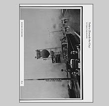
I cannot read French so I am probably missing some of the nuances of Didier Vivien's Archeologie de la Mine published by Marval in 1994 but it is compelling both in its photography and layout.
Archeologie de la Mine is about a major coal mine that existed in the northern region of France bordering Belgium from 1720 until its closing in 1990. It was the main source of employment for the surrounding towns which prospered because of the richness of the coal seams. It was also the site of Europe's worst mining disaster when on March 10, 1906 an explosion killed 1100 miners.
Vivien photographed the mine and its surrounding area in a fairly non-romantic tone considering the history and expected depictions of miners as heroic men working under miserable conditions. This is a colder view more akin to the authorless topographic-style especially when Vivien moves out of the mine buildings and into the landscape of shale heaps. The book ends with images of the transition into a suburban neighborhood complete with big box stores.
Book-wise, the layout of Archeologie de la Mine is very well conceived. Simple full bleed square images - many on facing pages that create dynamic spreads. The printing is a decent, open rendering of a full range of tone but to the attentive viewer it can be seen as slightly inconsistent throughout the book. Archeologie de la Mine includes a short essay by Eric Wawrzyniak.
I hadn't heard of Didier Vivien nor this book before discovering it by chance and I would be curious if anyone else out there had known of it. It seems like an overlooked gem to me.
![]()

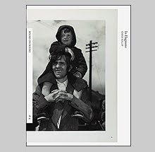
The invention of automobiles and the invention of photography both promised a new engagement with the larger world. As gasoline powered engines and shutter driven cameras proliferated, the 'far from home' suddenly became visible. Photographers embraced autos and their presence has often become a breeding ground for meaning. From Lartigue's early car pictures which feel futuristic and offer the promise of adventure to Robert Frank's images of the car as rolling isolation booths. Cars have represented a multitude of themes from wealth and elegance to violence and rampant ecological destruction. One of my favorite titles from 2010, Sebastien Girard's Desperate Cars takes a look at the autos around his suburban neighborhood in Toulouse, France.
There is little text at all in Desperate Cars, Girard opens with endpapers which plea 'Save Their Souls' - and follows with a concentration on the small damage and wear. Some have rolled in piss and shit; others have had their rear view mirrors smashed off; one has its bumper held on by bungee cords. It is all pretty minor - smashed windows and such - so one might ask 'who cares?'
Other photographers have done major work on vehicles that have killed their passengers and have been twisted into shapes unrecognizable. My interest in Girard's approach extends to what I see as one of photography's flaws. There is a tendency to look to extremes and I find it a much more interesting problem to look at the subtle and make it hold your attention. I have in the past written about how I perceived Raphel Waldner's work and I do find the descriptions seductive but this work seduces me in a much more nuanced way, for instance, Girard has chosen to describe his subject in the dark and from the same distance. Throughout Desperate Cars, the scale of the objects described are almost all similar. There is no medium shot or master shot etc - they are all close-ups. This unique strategy makes the book fell like you are revolving around the vehicles - navigating not so much a photograph, but navigating around an object. He sequenced these images with a flair for great pairings that complement the content and formal play as well.
As for the chips and bumps versus the great seven car pile-up fatality covered in crash-dust, this work is more about the wear of life rather than the moment of death. It is less common to die in a car crash than to have life simply chip away at you, like water does to stone overtime. These cars wear their damage like we wear our appendix scars.
Desperate Cars was self-published in an edition of 500. The quality is near perfect from the printing to the hand binding done by Van Waarden in the Netherlands. A signed and numbered limited edition with a print is also available. Sebastien Girard will be presenting his books and work at this year's International Photobook Festival in Kassel Germany from June 1-5th at Documenta-Halle.
![]()

Seen from the clouds, my old suburban neighborhood in Arizona with its dozens of cul-de-sacs must have looked like a gaggle of spermatozoa about to ride off into the sunset. Whether that was the holistic thought of the architect and land developer can't be confirmed - keep in mind it was the late 60s, early 70's though.
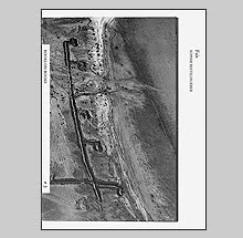
I would like to be able to read maps the same way that I read photographs. Meaning, to enable my first impressions to be filled with analogies, metaphors, and symbolism but instead, the rational mind takes over and I see measured facts and deadpan reality. For the German architect Oswald Mathias Ungers however, bridging imaginative perception and a blueprint from a city planner produced a fascinating book titled City Metaphors just re-published by Verlag der Buchhandlung Walther Konig.
Originally appearing in 1982, City Metaphors presents over 50 pairings of various city maps throughout history with images from science and nature. Each of the pairings is then "titled" with a single descriptive word printed in both English and German.
In Ungers' mind, the division of Venice becomes a handshake, a spirally designed city in India becomes the universe, the plan of the city of St Gallen, Merian from 1809 becomes a womb and so on. Easily, the formal similarities can be seen in each pairing but there is the third level of perception introduced by the title. The factual reality (the plan), the perceived reality (the image), and the conceptual reality (the word).
As Ungers writes in his foreword; The way we experience the world around us depends on how we perceive it. Without a comprehensive vision the reality will appear as a mass of unrelated phenomenon and meaningless facts, in other words, totally chaotic. In such a world it would be like living in a vacuum; everything would be of equal importance; nothing could attract our attention; and there would be no possibility to utilize the mind.
![]()

For years Photoworks has been commissioning photographers to explore areas of the South East of England, the results of those projects often wind up as exhibitions or, more importantly in my opinion, book projects. Last year Photoworks invited a few artists to explore Brighton and three new books have been published; one by Stephen Gill, one by Rinko Kawauchi and one by Alec Soth's daughter Carmen. My favorite of the bunch is Stephen Gill's Outside In.
With his ever present good humor and desire to think outside the box with his photography, Stephen decided to introduce material found in Brighton into the body of his cheap plastic lens camera. Thus seaweed, insects, broken glass, and garbage get in the way of his already hazy palette creating instant forms of collage.
Now those familiar with my past opinions of Stephen's books will know that I have a way of loving the way the books look and feel but find the actual photography not as interesting. Hackney Flowers is my personal favorite, Hackney Wick I still don't understand the fascination people seem to have with that title. Ok, so it wasn't my cup of tea.
My enjoyment of Outside In is curious to me because what I can see through all of the silhouetted objects in these pictures, the actual photographs aren't brilliant by themselves. Nor is the interplay between the objects and the image as strong as on display in Hackney Flowers, yet I am captivated by this little book. I think partly because in addition to the beauty of some of the images it provides for me fascinating puzzles of the optical properties of photography.
How, for example, does there seem to be a piece of electronic (?) equipment inside the camera rendered as if it was itself photographed in natural light (see fifth image in comp above)? Also, I imagine that if one introduced a lot of three dimensional objects into a camera such as this, when the camera was held up to make an image, most of it would slosh down to the bottom of the camera (which would actually be the top of the frame) yet in Gill's images much of it seems to be defying gravity and evenly disbursed. I am not doubting Gill's claims of process - just aspects in some of the images confound me, albeit in pleasurable ways.
Gill makes the analogy in his brief afterword in Outside In that these photos are like the "regurgitated contents of a giant vacuum cleaner bag." I like the thought of that. Photography already holds the potential for producing the illusion of literal and almost infinite description in "straight" practice. Gill's images seem to have physically sucked up parts of the world, shook them around unpredictably, and spilled the contents onto pieces of paper - a new order that is as messy and confounding as the world itself.
Outside In was published by Photoworks and the Archive of Modern Conflict.
![]()
Seeing the name Paris scream across the cover of Krass Clement's newest book Paris: Carnet de Recherche I braced myself for disappointment. The "home" of street photography has produced numerous books in the past which find themselves amounting to little beyond "greatest hits" collections of images offering syrupy nostalgia and no surprise. Clement is well aware of those familiar trappings - perhaps that is why the cover image printed right on the book's cloth shows a romantic Paris metro X-d out by a couple of steel girders. His is an uphill battle which I am delighted to see proves he is an artist who tests our expectations.
As in the best of Clement's books, Paris: Carnet de Recherche is a personal journey. Starting with a suite of images entering the city by train, we pass by cold landscapes of factories in dense grey light. Upon arrival, the city itself and its citizens appear weighed down and sluggish. Light seems to fight to illuminate the architecture and streets. It is hardly a warm arrival - our first destination - an empty cafe.
Photographed in both 35mm and square formats, Clement weaves through the city lingering for moments on small sequences of images - a woman improvises a dance in a bar that briefly lightens the mood; a protest in the streets led by youth. Interspersed are a few intimate images of women in hotel rooms, perhaps we are not traveling alone but our wanderings in the streets seem perceived through the eyes of someone longing for connection. Less for connection to place but for people.
In many of Clement's books of the past there is an obvious filmic quality. The repetition of images allows the subtlety of events to play out with surprising result without feeling indulgent. Following the gestures of a man swallowing a drink while two women gossip in the background is resonant in its simplicity. There is less of that "step by step" quality here which I find often so powerful, but I suppose it is due to when these images were made in his life as a photographer. Photographed in the 60s and 70s these would consist of early works of Clement's perhaps done before he was fully conscious of the methods he would employ in his later work and bookcraft. Here the sequence at times feels like a stream of jump-cuts and can appear sporadic. This might have been a fatal flaw to the book had Clement not been the great photographer he is. Still, he finds the connections between the individual frames to form links that, for the observant, will not disappoint. The end picture of a sequence of nighttime streets protests of youths burning a car is of a small wedding party where the wedding dress and veil reflect the previous conflagration. In another pairing, a woman on a subway hangs on the arm of a lover while on the facing page, a woman supports a dress she is offering for sale at a street market.
Bookwise, Paris: Carnet de Recherche is beautifully done. The publisher Gyldendal which releases many of Clemen't books has again done a superb job with design and printing. One relief is that there is no introductory text nor afterword - the photographs are allowed to stand on their own as an open-ended journey.
Clement's Novemberreisse from 2008 was one of my favorite books of the year and I was happy to see Paris: Carnet de Recherche appear as a "best of" suggestion by a couple people in the comments of my 2010 list. It was a steady contender for inclusion on mine as well but it has taken me some extra time to fully appreciate its nuances. Like most of Clement's best, it is a slow and quiet burn that lingers long after the covers are closed.
![]()